Follow @tinyrexwrecks
Showing posts with label illustration. Show all posts

Friday, 1 March 2024

Speech bubbles

My next book features one of my favourite things: speech bubbles. And my two main characters have their own designs.


I wanted both Watts and Pearl's speech to have straight edges to show they are logical and that they have something in common but I also wanted their speech to reflect their individual personalities.

Pearl is unpredictable, spontaneous and quite loud so her speech bubbles have sharp, oddly angled edges and are a bold colour.

Pearl


Watts is more considered, speaks softly and is a little unsure of himself so his have rounded edges and no colour.

Watts


I wanted readers to be able to easily tell who was speaking when they speak to one another, and on occasions when the characters are very small the speech bubbles help identify them. Like this...


Everyone else in the book uses the same soft pink bubble. To have too many variations would get visually busy.

This is Houndstooth the gardener.

Watts and Whiskerton: Buried Bones and Troublesome Treasure publishes on July 4th 2024 and you can pre-order it by clicking here.

Friday, 23 February 2024

Roughs

When you illustrate a book you go through a stage called roughs. These are ideas of what will be drawn on every page of the book, bearing in mind where text will fit, and as their name suggests they are rough drawings. There are varieties of roughs though. I've seen some much looser than mine, and others so polished they look like finished artwork. Because picture books are so much about the images I make my roughs while I write. I can't separate the two processes.


Watts and Whiskerton is a highly illustrated young fiction book and I wanted the illustrations to be as important as the text. They hold visual pieces of information and readers will flit between the body of text, illustrations with speech bubbles and little comic strips. It sort of looks like the inside of my head. This is how I think. So as I wrote the first draft I created an even rougher set of roughs to send to the editor with the text to help her make sense of the book. It also really helped me pace the page turns and develop the plot. I call these rough roughs.

Here is the rough rough of the museum.


At this stage it's not necessary for me to know what the little details in the book will be, and to be honest I was scared to draw a whole museum.

Once the text was finalised and set by the art director, Sarah, we flipped the image to make sure the text was read before the 'Wow!' and more detail was added. This is the proper rough, there's a whole chunk of time scheduled to make these. This a simple spread but on others we had to cut text to fit or adjust the layout altogether.

The pink part is where you can't put any important information in case it gets chopped off.

This is the final image.

The black line is where the pages will be cut.

The details include some exhibits for Watts and Whiskerton to investigate later and nods to some famous paintings including A Bigger Splash by David Hockney because a swimming pool is a plot point in the book.


Watts and Whiskerton; Buried Bones and Troublesome Treasure publishes July 4th 2024 and is available to buy by clicking here.

Friday, 16 February 2024

Cover Ideas

 My last post was the cover reveal of my next book, Watts and Whiskerton: Buried Bones and Troublesome Treasure. Here's a little breakdown of how the cover was made.


Usually when you're part way through colouring the insides of a book someone will mention the cover, and you think, 'The Cover?!' Or I do because I never have a vision for book covers until I'm asked to think about it. So when the cover question arises I sit and sketch little thumbnail ideas and I send these to the art director, Dominica, to see if she thinks any of them are worth developing further. Sometimes it's elements for various ideas.

Can you see which one became the cover?

We hadn't yet discussed how the title was going to appear but she soon sent some variations on the Watts and Whiskerton branding for me to choose from, picked some favourite ideas and made some suggestions about moving forward. We'd discussed using a faux quarter binding too (that little decorative strip down the book's edge.)

Then I sent these...


We decided to use the lower left torchlit image but to add some bones and treasure for hints of colour, and I was asked to send some colour ideas. I sent endless variations. Honestly, there were so many. The paw print pattern is used inside the book and we decided this would work nicely for the quarter binding too. Here are a select few of the colour trials.

There were also decisions to be made about Pearl's outline and Watts' suit colour because the insides of the book are limited to black, white and red but on the cover we can do what we want.


We picked the blue suit.


Watts and Pearl together.


From then on it's a case of me making the thing properly, asking for suggestions when I get stuck and then adding more until we all agree that it's finished. We decided to contain the Watts and Whiskerton lettering in a frame and removed the house silhouette. They were fighting each other. I added some coins and rose petals to add colour to the lower underground section and we used the red from the inside of the book for the quarter binding. I think it turned out nicely. Here's the final cover...


Watts and Whiskerton: Buried Bones and Troublesome Treasure publishes July 4th 2024 and is available to buy at your local friendly bookshop, just ask them. Online you can buy here.

Tuesday, 29 November 2022

Christmas Shop

 My shop will be open until December 6th.


Due to ongoing postal disruption, and the dreaded Christmas post office queue, I'm going to shut up shop early this year.  But until then I still have plenty of Xmas gifts.

Christmas Knits 

Like this pack of 4 christmas mice cards CLICK HERE

I've also added some etchings all of which can be found by CLICKING HERE


An original gouache painting 


I have blank notebooks to draw and write in.  Made from recycled materials.  


I have plenty of prints and things too.  Feel free to look around.  On December 6th my shop will shut and I'll eat biscuits.  Thank you for supporting small businesses.


Wednesday, 27 July 2022

Bluebell Woods


A sketch of my local woods in two colours.  It gets full of bluebells, hence the title, but none were present when I drew it.


Monday, 11 April 2022

Tiger process

This is a little tiger idea I've been thinking about.  My idea feels too simple so I thought making some of the images might help unlock it.  There's a quick breakdown of how I made the image below.


I was working on this image on Friday which is also #colour_collective day, and I like to join in from time to time.  Luckily, the colours were a perfect fit for my tiger (see below).  I like how unusual the purpley blue is but I do think the darker colour I settled on is a bit punchier.

My colour collective original

Lately I've been making artwork like I would prepare a screen print.  For every colour I make a separate black layer.  Imagine the black lines are where the colour will be and imagine that where the paper is white will be clear.  Completely see through.  It takes a minute to get your head around this.  I like to use paint because I'm not very practised with a brush and it allows a less controlled line.  That's why I like this whole process, and it means I spend less time at a computer.

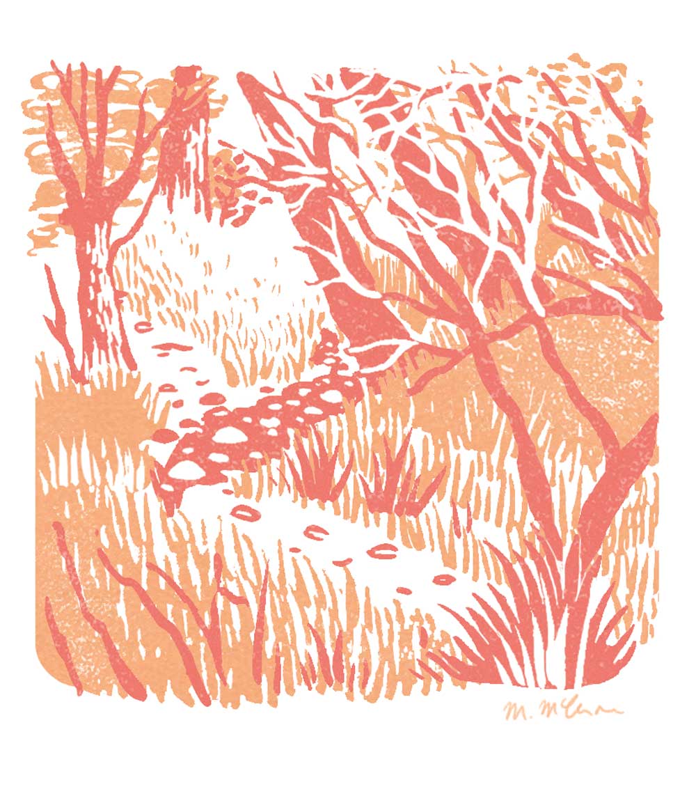
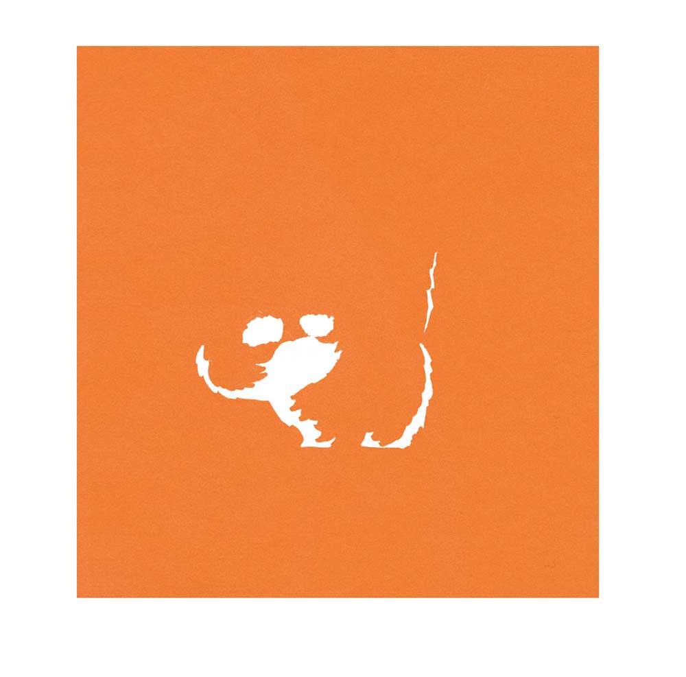
I knew this was going to be a two colour image (a dark and an orange plus white) but I wasn't sure if the background would be too busy so I broke the trees into two separations to make it easier to delete one if I needed to.  And I wanted to test the tiger outline in both paint and pencil so I kept that apart from the background.  This is what everything looks like separately.

Trees and paint tiger stripes


Bamboo

Tiger outlines and fur tests

The top row is the tiger outline.  As much as I like my backgrounds to feel loose, I still like the control I have with a pencil for character outlines.  I've drawn it twice because I was testing a regular HB pencil (left) versus a softer colouring pencil line (right).  The second row is me testing the fur texture of the tiger.  Ultimately, I used the image on the right.  I placed this over the tiger and coloured everything outside of it black too.  This was going to be my orange layer.

If I lay them all over each other you can get an idea of what the image will look like.


All the separations placed over each other

I scan all of these into the computer and line them up on my page.  I spent some time deciding between the painted stripes and the pencil and edited the layers accordingly.

Once I've blocked in the basic colours it looks like this.

Dark layer
Orange

One layer over the other


I then spend some time editing the image, adding details like highlights, whiskers and fur lines, and I make the image more textured.  I have a selection of textures I've created that I delete from laters to make them look more worn.  I also decide on the final image to use a yellow layer over a red instead of one layer of orange.  That way I could delete parts of each colour and you'd see the red and yellow peek through.

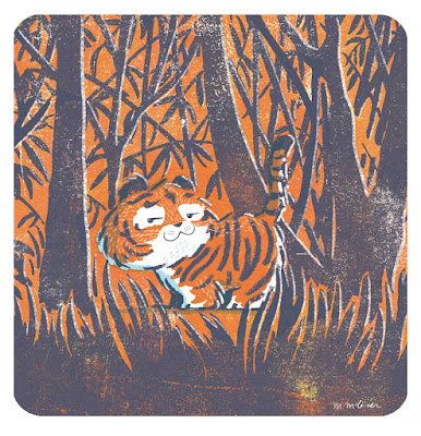
The final image looks like this


It probably seems like a long way of doing things but I find the painting relaxing.  My previous Dream Cars post was made similarly except I drew all the colour layers digitally in Procreate, there was no painting.  That works well for me with vehicles and structured items but for more natural imagery I prefer to paint in a traditional way.


Thursday, 7 April 2022

Dream Cars

One of my earliest memories of school is being in Primary 1 and drawing a car.  They told us to draw anything we wanted and I couldn't think of anything but the person next to me was drawing a car so I drew one too.  I don't think I've drawn a car since.  So this week I had a go.  

This is Jon, he wanted to be a fox, in his dream car (which is almost exactly my actual car but according to him it's not the same).

And this is me in my Nissan Figaro.  They're such cute little cars.
Both images were sketched in pencil first and then redrawn in in Procreate using my sketch as a guide. The textures and colours were finalised in Photoshop.  I'm still far more skilled and at home in photoshop but I do enjoy drawing on the Ipad.  It's great for blocking in shapes.


Wednesday, 2 February 2022

The Darling Children

These are the Darling children from Peter Pan by J.M. Barrie.  The first chapter has a lot of nice descriptions in it that feel very visual.  I love this one of the kids going to school.  I think it's the 'in a row' part I like so much. 

 '...and soon, you might have seen the three of them going in a row to Miss Fulsom's Kindergarten school, accompanied by their nurse.'

This image was made digitally in Procreate.  I like the ease of digital black and white drawing but I'm not convinced yet that it's a way for me to work permanently.  I still do love drawing in pencil.

Wednesday, 26 January 2022

Nutcracker

 A little Nutcracker I made before Christmas.  This was made digitally using Procreate.  I then added texture in Photoshop.  It's a two colour image and where they overlap the darkest tone is created.


Friday, 12 November 2021

Designing Christmas Cards

For my Christmas card designs this year I wanted to keep things simple.  I decided to make a pack of four cards with two designs using red and white and two using green and white.  The colour limitation really helps me to focus and means I won't get too carried away.

Below you can watch the process video for my Winter Warmers card.  As you may notice I begin with a very loose outline and build the detail as I go.  This was drawn on Procreate on an Ipad.  It's a process I'm new to as I usually do all my drawing on paper first but this saves a lot of tidying.  I won't be switching to full digital drawing anytime soon though.


I had a lot of fun designing knitwear patterns for the mug and on the other cards.  

And here is the full set.


Thursday, 4 November 2021

Wintry Woods jotter design

 I've recently added some A5 jotters to my shop. They weren't supposed to Christmassy but it's been pretty chilly here for a long time so I was feeling wintry, and really I'd like nothing more that a snowy mountain cabin to myself.

Click here to go to the shop.  

Here's a time lapse video of my cover design.


I did an initial sketch in my sketchbook and then drew straight on to Procreate.  I love how you can watch all the decisions you made.  I'm really happy with the way they turned out.  There's even a cute little 'This book belongs to' on the inside cover, and they're blank so you can sketch or write.  


Monday, 16 August 2021

The Owl and the Pussycat


This is an image I created using limited colour.  There are two plus the outline.  I wanted to try and recreate the looser work I'd been making using paintbrushes but digitally.  The outline is hand drawn  but the colour is added in Procreate. 

Digital work makes it very easy to erase mistakes but they're often the lines that give images their charm.  So I did my very best not to hit the undo or delete button.  Does anyone else find it hard to just leave their artwork as it is and embrace the imperfections?

You can see more of my limited colour work on my website megmclaren.com


Tuesday, 1 June 2021

The View From Here

This was my #colour_collective for this week. 


It's the view from my village woods across to the Black Isle.  I made this sketch sticking to the three colours I planned to use.  More and more I prefer to draw from life in my sketch book and only work from that image, as opposed to working from a photograph.  Sometimes I will take a photo for reference but, for me, a sketch really focuses in on what I noticed and what I liked about the scene in front of me.


When I got home I painted separations in black and coloured the image digitally.  Using a black layer for each colour means that it's hard to predict what the final image will look like.  I like the surprise of this.  I also like painting the layers because I'm not very good at it.  My brushwork isn't tidy and my hand isn't steady.  There's an element of it that I can't control and I really enjoy the results of that.


You can see below how layering them on top of one another starts to create the final image.  Colouring digitally does mean I can change things and you may notice that the big expanse of white water isn't in the separations.  That's because I painted it in the blue colour layer but removed it digitally as the image looked better without it.


I wasn't entirely happy with the result but after tweaking the colours and leaving it for a while, I much preferred it once I'd had some time away from it.  Some pictures are like that. 

Tuesday, 25 May 2021

New cards

 I've added some new card designs into my shop this week.  You can view them here.

Here is a look at the new single card designs.


Mirror, Mirror

Season's Readings

Toot Your Horn!

These Highland Blues are based on my #illo_advent drawings 2020 and are sold as a pack of three.

Highland Blues

Feel free to have a browse around.  I also sell screen prints and risographs.


Friday, 19 March 2021

Book Nook Blue


Another colour_collective.  This time they chose a colour that I use all the time.  This dark blue features heavily in my work. Trying to decide what to do felt odd because I've never noticed how much I use it before.  To do something specifically with this colour felt like pressure had been added.  Anyway, I like the beaver.