Happy New Year everyone! It's 2025. I signed my first book contract in December 2014 so I've now been making books professionally for ten years.
This would be a good time to tell you what I've learned but every book feels different, and I still don't think I have it all figured out. I do know that my way of making books has changed dramatically in some ways and is still exactly the same in others. At the moment I'm doing a lot of digital drawing, something I couldn't have done when I started making books. I could barely use a tablet with my laptop! But I still use Photoshop to arrange my images and make the final art.
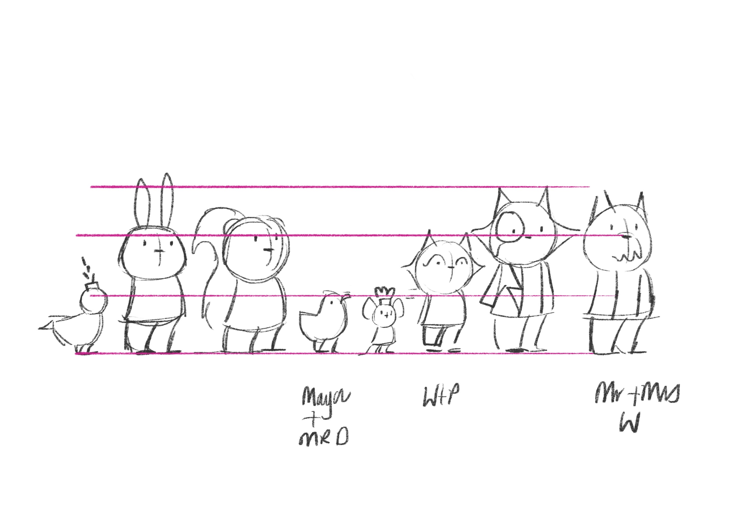
My first picture books (and most since) have pencil outlines but I've started to use a mix of pencil and digital lately, for time more than anything. I spent sooooo long tidying pencil lines on some of those books and for my Watts and Whiskerton series there isn't time for that. There's 128 illustrated pages per book and since the colour is added digitally I decided to try and do the outlines the same way.
This was quite a scary way for me to work. When I first started experimenting with the Ipad and Procreate I couldn't get results that I liked. As with everything, time and practice helped a lot. Here are a few of my brush experiments for Watts and Whiskerton.
I experimented with Watts' fur with no outlines but ultimately that was time consuming too. So I made my drawings as simple as I could, and I tried to find a brush that looked like pencil. For the final illustrations in the book I have one brush for all of the outlines, one for blocks of colour and one I like for shadows. Keeping it simple seems to work best for me.
I'm not sure if these early drawings use the brushes I use now but the look is pretty similar. It was only once I made these images that I was confident I could make the whole book look the way I wanted digitally.
Who knows how I'll be working in ten years' time!


