Follow @tinyrexwrecks
Showing posts with label picturebooks. Show all posts

Thursday, 23 February 2023

Wee Unicorn - Colour Palette

As someone who loves printmaking I have always been a fan of the limited colour palette. My previous books have all featured items in whatever colour they needed to be but Wee Unicorn is different. I knew I was making a fantastical world and decided that would be the perfect environment to use heightened colour.

In the months prior to making the book I'd been doing a lot of sketching using only two or three coloured pencils. I was used to working in a limited way, and I loved the challenges it created.

I had one other reason: I knew my book was going to feature a Loch Ness monster style creature. Now, I live in the heart of Loch Ness monster country and there's a very distinctive colour I associate with it and many of the books about it. You can see it right in the middle of this Emily Mackenzie poster. Four rows down, four across: she calls it 'Nessie'.  


I wanted to avoid this colour. I wanted to make something contemporary and visually different so I decided to get rid of the green. Of course, I can create a green with my blue and yellow but I wanted to use it sparingly and definitely not for Ness. I also started sketching ideas for the book over winter when many of the greens were gone. We have so many burnt oranges, deep burgundies and purples in our landscape that I wanted to celebrate. When I started sketching the book I used these four colours.  


A peek in the sketchbook


And I really liked them. When it came time to make the artwork for the book I did wonder if they'd be too overwhelming so I did a test page. This is a quick test on my Ipad to see how the blocks of colour might look.


Next I did a proper layout with the textures I was planning on using.


The larger image are the colours I ended up using. The smaller was an alternative I explored. As you can see they're incredibly similar but the turquoise was a little bluer, the pink a little brighter. And although these shades worked nicely, the secondary colours they created weren't as good.

These are my four final colours.

I used these four colours and layered them to make the secondary colours. If you imagine each colour is a layer of coloured glass it makes more sense to understand that when two of them overlap a new colour is created.  

You get even more variation when you start layering three or four of the colours together.  Here are a few different combinations from the book.


I like that the cover ended up being a nod to the colour palette.

I'm really pleased with the way the book turned out, and I really enjoyed working this way.  I'd love to do a book with only two colours someday.

Wee Unicorn is available to buy now. Click here for links.

Or you can look for it at your local library.


Thursday, 2 February 2023

Wee Unicorn - Character Design


The weird thing about living in Scotland is that there are unicorns everywhere.  On flags, as statues, and on coats of arms, but after a while you stop noticing them.  They're our national animal.  Here are a few of the Inverness unicorns.


Before I wrote Wee Unicorn I hadn't given them a lot of thought.  And I'd unfairly been a little dismissive of them lately.  There seemed to be unicorns everywhere. 

Normally when I write a book I come up with the character first.  For Wee Unicorn I'd been discussing Scottish folklore ideas and creatures with my editor and so I didn't actually have a character yet.  The first challenge for me was to see if I could draw a unicorn (at all!) but, more importantly, one that felt like mine.

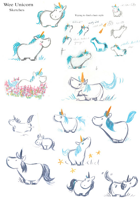
My immediate worry was that unicorns are horses, and wise illustrators know to avoid these because horses are hard to draw.  But all of my main characters are very young, they're the equivalent age of the child reading the book, so they're often small too.  Lesson one: small horses are easier to draw than tall ones.  Manes are harder to draw than you'd expect.  These are the first sketches I did. 


It's hard to describe what I'm looking for when I do these.  I'm obviously looking at things like face shape and proportion, trying to make the most appealing version I can, but I'm also looking for personality.  A drawing that is not just a drawing but that has a little bit of life in it: a character.  It's one of those know it when you see it sort of things.


You can see I'm experimenting with textures, the mane, the first inkling of a scarf, and I'm adding little bits of information that will eventually make up the story.  I don't really know anything about character design but I always draw mine in different moods and situations.  My character design always ends up being how I figure out what the book is about.

Here I've moved on to playing with colour and working out what a Wee Unicorn might actually do all day.  There were many things to consider.  Does my character use their hooves like hands?  Walk on hind legs?  I wanted her to be essentially horse-like, but that does limit what the character can do, especially one so small.  I kept hearing talk of unicorns being magic but it made no sense to me.  I didn't understand how they were magic, what their powers were or why.  Funnily enough, this became my way into the book.  I decided to write about a unicorn who was very small, loud and not magic, even though everyone expected her to be.  I wanted her everyday qualities, ones that were taken for granted, to be what was truly magical about her.  Once you know who your character is they are easier to write about.

Even though I'm experimenting with markings you can she's almost the Wee Unicorn from the book.

I knew my backgrounds were going to be very vibrant so I wasn't too worried about Wee Unicorn being pure white.  I thought she'd stand out nicely but I did want to give her a little something.  I thought a scarf would be a nice detail.  You get a lot of movement in a scarf if your character is running or the wind is blowing.  It's a nice pop of colour and it's cold in the highlands too.


I wanted to keep it traditional looking so I made my version of a Fair Isle knit.  I chose the crown as a motif because unicorns are seen with a crown around their necks on the coat of arms.  I wanted to add a little nod to that.


Wee Unicorn is published by Hachette Children's Books and is available to pre-order now.
Please support your local bookshop or an online indie if you can.

Here are a few places you can buy it CLICK HERE


Wednesday, 2 June 2021

One more day to go

Peep! is out tomorrow.  To celebrate I made this little gif of Dot.  She is patience personified.  Unlike my own dog who only stares out the window to bark at passing cars, the postman and the wind.


Peep! is published by Andersen Press and available to buy wherever you get your books.  But please support your local bookshop if you have one, or take a look in your local library.  Libraries and bookshops are the best.


Thursday, 30 January 2020

And the winner is...

The Bookbug Picture Book Prize 2020 winner was announced yesterday and I'm happy to report that The Station Mouse won. Woohoo!


The beautiful trophy was made by Emily Hogarth

Every year Scottish Book Trust give all of the primary one children in Scotland a Bookbug bag containing three shortlisted books.  This year Scottish Book Trust gave out an incredible 189,000 books in these bags alone.  That's 63,000 bags!  The most wonderful part of all this is that young readers get three great books of their very own to keep.

The winner is picked by the readers too, which for me is the loveliest part.  It's really nice to know that the people you write books for are actually enjoying them.  Thank you to all the schools who took part, all the libraries that helped out and to all the pupils for voting.

Here is the announcement video.


Huge thanks to Liam, Heather and Jonathan who made this video, and to Hannah who filmed the shortlist videos, you who were all so helpful and supportive.

Maurice and I are off to celebrate with our favourite things, cheese and cake.  Maybe there's a way we can combine the two...

Thursday, 31 May 2018

One week to go...

My next book, The Station Mouse, is publishing one week today.  That's when Maurice will begin his new job.  He's a very responsible mouse so he's got it marked on his calendar.  There's still a lot of unpacking to do, but with a whole week to go I think we can let him sleep a little longer.


Wednesday, 24 January 2018

The Wizard of Oz

Finally, after months of working on it and keeping quiet, I can reveal that I've illustrated a new picture book version of The Wizard of Oz adapted by Sam Hay and publishing with Egmont in September.

It's more than a little intimidating to reimagine a classic like this but I hope that for young readers it'll be a fun introduction to the land of Oz.

You can read a little about it  here on the Egmont blog

My art director, Abi, and I spent a long time working on cover ideas but in the end we wanted something that really showcased the characters.  Here's a sneak peek...


Sunday, 26 February 2017

Pigeon P.I. cover

My second picture book is publishing this week so here's a post about how the front cover was made.  Don't worry, I've spared you the gazillion colour choice screenshots I took!


Back covers are one of my favourite parts of a book.  They have all the fun of the front cover with none of the responsibility.  I usually leave the back cover until the very end and so far they've always been great fun to do.

The back cover means more room for silly jokes and shenanigans.  


For me, the front cover is the hardest part of any book I make because it's the first thing that people see.  It has to invite readers in and tell them a little bit about what they'll get inside but not everything.   You want people to want to pick it up, to be able to see it across a room and equally to be able to read it when it's tiny on their computer screen.   This is probably the part of the book that my art director and I spend most time discussing, sending ideas back and forth, usually over a period of a few days, refining as we go. 

This was an early idea we had but it never made it any further.  We wanted to make sure we introduced both Murray and Vee (pigeon and canary respectively) and also had a little bit of a narrative.  I particularly liked how Vee's shadow put her on the poster beside Murray, foreshadowing things to come.  I forget why we chose not to use it, but I still like it.

Here are some sketch ideas.  I tend to send every little doodle.  I find that drawings I'm not sure about can often spark ideas in other people and we can end up using them for something somewhere.

This was the sketch we thought worked best as an idea.


This image made its way onto the case cover beneath the dust jacket.

Some more ideas for the cover, case cover and a few fonts I liked.


We tweaked the image a few more times to make it into this.  We wanted to keep the noir feel and the implication of danger whilst showing through Vee that this would also be a really fun, silly book too.


The hardest part of this cover was the font.  Compared to Life Is Magic this looked like quite a simple book lettering-wise.  But with five separate character fonts, the background posters and adverts plus my simple* endpapers, there ended up being a lot more. 


(*My endpapers were simple.  I wrote this in an email to my editor.  I forget how simple they were, but at some point I had a great idea which turned out beautifully and was by no means simple after all.)

Anyway, the cover went through several rounds of hand-lettering.  I do a lot of typography for someone who is still very much learning as I go, so my way in is a little like that part in The Shining where Jack Nicholson is typing 'All work and no play make Jack a dull boy' over and over.  Like so...


Once I see something I like I'll do my best to refine it.  We actually settled on a font, a perfectly nice one, but decided it wasn't strong enough.


Back to the drawing board one more time and we cracked it.  I'm so glad we re-did it.  The final lettering turned out really nicely, especially with the shiny gold foil finish.


So shiny!


Pigeon P.I. publishes on March 2nd.


Monday, 20 February 2017

Making Pigeon P.I.

Since my second picture book Pigeon P.I. is published in but two weeks, I thought I'd put together a little how-it-was-made.

Pigeon P.I. started life as a flash of inspiration.  I was working on ideas for my second book and I already had a pretty good one.  I wasn't sure if it was THE idea but I liked it.  With about a week to go before my meeting at Andersen Press I had an idea I was far more excited about: I was going to write a film noir picture book and call it Pigeon P.I.  It sounds so simple when you say it out loud but ideas are like that, they're exciting and instant.  It takes a lot of work to make them into something more.

Is it a mystery?  The words 'private investigator' should've been my first clue.


I started to draw using Humphrey Bogart as inspiration for Murray, my pigeon (apologies to Mr. Bogart)

The first Murray.  Sadly, 'you filthy corn husk' didn't make it in.


Faye Dunaway from 'Bonnie and Clyde' helped inspire my canary Vee.  Apologies to Ms. Dunaway but I wanted someone who looked great in hats and there's no denying that she does.

First sketch of Vee

One of many test drawings of Vee

A few more tests.  My art director Beccy and I spent a long time working on what made Vee look young and appealing.  We shortened her hair flick and really focused on her shape.   She was definitely the hardest character to get right.  


The final Vee


I didn't have a story yet but I had most of the characters and a world I wanted to build.  Most importantly I had an idea I was passionate about.  It was THE idea.  Here's some of the sketches I prepared for my meeting.


I make a lot of notes.


This neon colour test didn't make it in but I still like it.


 I was watching Chinatown at this point.


From the final book.

A little joke about a spin-off series


Take a peek under the dust jacket to meet Penguin P.I.
First sketch of the police, who nearly didn't make it when my first draft came in at 50 pages

Sadly the night watch don't feature.  They're biding their time.


 Luckily, the good folks at Andersen Press liked this idea too and we spent our meeting discussing character motivations and all things noir.  With all sorts of wisdom imparted, off I went to sit with my sketchbook to see if these characters really had a story to tell.  It's funny to look back and see how many stages a book goes through when you write it.

This pie-as-an-escape plan is one of my favourite drawings that never went anywhere

It's also amazing to see how much sticks.  One of my very first drawings has remained the whole way through as my first page, with pretty much the same first line.


Only I could think a pile of abandoned newspaper is a 'filing system'

Murray and his filing system


I'm pretty excited about the way this book turned out, it's very different to Life Is Magic but I think they've got some things in common, namely an excess of hand-lettering and background characters.

A note to myself


What I wanted to create was a satisfying mystery in picture book form, to pay homage to the detective books I've loved all my life but to make sure that I was writing it for a picture book audience, that this was a satisfying world and story in itself and not just a parody of something I loved.  I hope I've managed to do that.