Follow @tinyrexwrecks
Showing posts with label cover design. Show all posts

Tuesday, 28 October 2025

Cover reveal - Watts and Whiskerton book 3

 Hello! This is an exciting day because I can finally reveal the cover for Watts and Pearl's next adventure: The Great Glacier Hotel Heist.


Watts is looking forward to a holiday at the Great Glacier Hotel and Ski Resort. But when they arrive, his and Pearl's quiet vacation soon turns into another high-stakes investigation: the priceless Ice Crystal has been stolen from the hotel safe, and his parents are the prime suspects!

Will Watts and Pearl be able to clear Mr and Mrs Watts' names? And will they be able to catch the real jewel thief? This dog and cat detective duo will have to navigate through heavy snow, suspicious staff, and a locked room mystery. But will they manage to ski, sleuth 
and save the day?

It publishes next year but is available for pre-order now by clicking here.

Or you can ask your lovely local bookshop to order you one in.


Monday, 27 January 2025

Cover design - Sabotatge at the Fete Cake Bake


For the past few weeks I've been working on the cover artwork for Watts and Whiskerton book 3 (which I have to keep under my detecting hat for now.) Instead I thought I'd show you how the book two cover was made.

The first thing I do is think about what the book is about, and how to show this on the cover. This book takes place at the Little Gossip Fete Bake so I wanted to included baking equipment, a cake, some detective items, and to try and show that something had gone wrong. I make sketches of all my ideas and send them to the art director. Here are the sketches I sent.


The art director will then send me one or two images back that she thinks works well. The other sketches aren't wasted though, for this book one of them was used for the back cover.

This is the sketch we decided would work best for the cover. 

The next step is to draw the image and items at the correct size and to make sure there's room for the text to fit. You'll notice the image has changed slightly. Pearl gets a chance to bake in this book so I thought it'd be fun if she mirrored Watts' costume but with a baking hat instead of a bowler, and a spoon instead of a magnifying glass. I was unhappy about the bunting layout too so I adjusted that.


Once the art director is happy that everything is in place I start the final artwork. Utensils and shelves of equipment were added to fill out the background. I tried a few different expressions on each of the characters and we spent a lot of time perfecting the colours. Here is the final cover.


Watts and Whiskerton: Sabotage at the Fete Cake Bake is publishing in April, but is avaliable to pre-order here. Please support your local bookshops when you can. 

And if you missed their first adventure, Watts and Whiskerton: Buried Bones and Troublesome Treasure is out now. Have a look in your local library or a friendly bookshop near you.


Friday, 16 February 2024

Cover Ideas

 My last post was the cover reveal of my next book, Watts and Whiskerton: Buried Bones and Troublesome Treasure. Here's a little breakdown of how the cover was made.


Usually when you're part way through colouring the insides of a book someone will mention the cover, and you think, 'The Cover?!' Or I do because I never have a vision for book covers until I'm asked to think about it. So when the cover question arises I sit and sketch little thumbnail ideas and I send these to the art director, Dominica, to see if she thinks any of them are worth developing further. Sometimes it's elements for various ideas.

Can you see which one became the cover?

We hadn't yet discussed how the title was going to appear but she soon sent some variations on the Watts and Whiskerton branding for me to choose from, picked some favourite ideas and made some suggestions about moving forward. We'd discussed using a faux quarter binding too (that little decorative strip down the book's edge.)

Then I sent these...


We decided to use the lower left torchlit image but to add some bones and treasure for hints of colour, and I was asked to send some colour ideas. I sent endless variations. Honestly, there were so many. The paw print pattern is used inside the book and we decided this would work nicely for the quarter binding too. Here are a select few of the colour trials.

There were also decisions to be made about Pearl's outline and Watts' suit colour because the insides of the book are limited to black, white and red but on the cover we can do what we want.


We picked the blue suit.


Watts and Pearl together.


From then on it's a case of me making the thing properly, asking for suggestions when I get stuck and then adding more until we all agree that it's finished. We decided to contain the Watts and Whiskerton lettering in a frame and removed the house silhouette. They were fighting each other. I added some coins and rose petals to add colour to the lower underground section and we used the red from the inside of the book for the quarter binding. I think it turned out nicely. Here's the final cover...


Watts and Whiskerton: Buried Bones and Troublesome Treasure publishes July 4th 2024 and is available to buy at your local friendly bookshop, just ask them. Online you can buy here.

Sunday, 26 February 2017

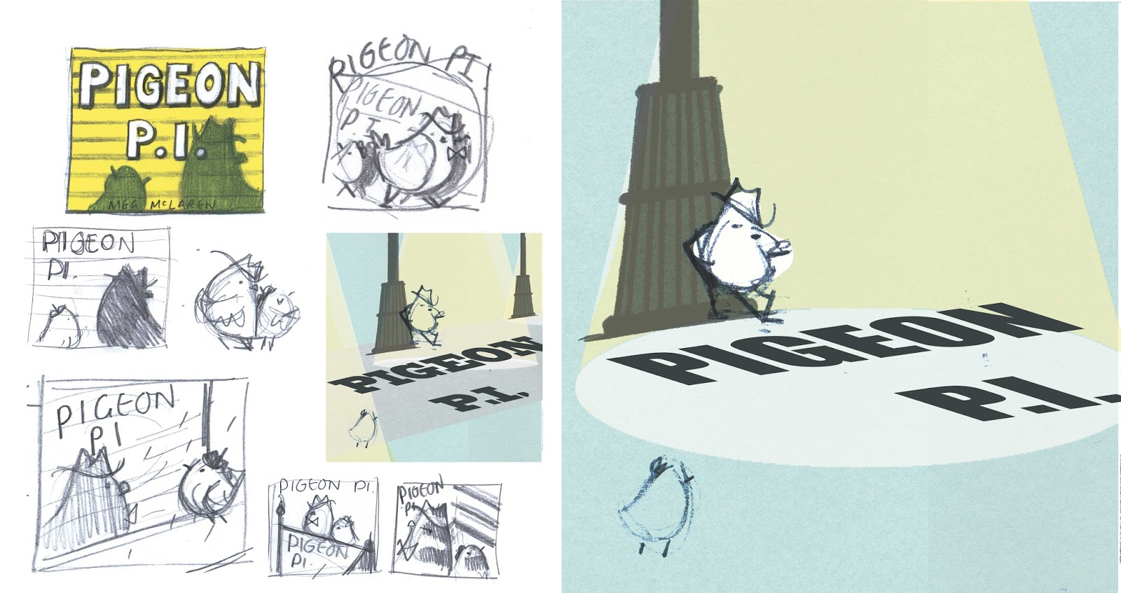
Pigeon P.I. cover

My second picture book is publishing this week so here's a post about how the front cover was made.  Don't worry, I've spared you the gazillion colour choice screenshots I took!


Back covers are one of my favourite parts of a book.  They have all the fun of the front cover with none of the responsibility.  I usually leave the back cover until the very end and so far they've always been great fun to do.

The back cover means more room for silly jokes and shenanigans.  


For me, the front cover is the hardest part of any book I make because it's the first thing that people see.  It has to invite readers in and tell them a little bit about what they'll get inside but not everything.   You want people to want to pick it up, to be able to see it across a room and equally to be able to read it when it's tiny on their computer screen.   This is probably the part of the book that my art director and I spend most time discussing, sending ideas back and forth, usually over a period of a few days, refining as we go. 

This was an early idea we had but it never made it any further.  We wanted to make sure we introduced both Murray and Vee (pigeon and canary respectively) and also had a little bit of a narrative.  I particularly liked how Vee's shadow put her on the poster beside Murray, foreshadowing things to come.  I forget why we chose not to use it, but I still like it.

Here are some sketch ideas.  I tend to send every little doodle.  I find that drawings I'm not sure about can often spark ideas in other people and we can end up using them for something somewhere.

This was the sketch we thought worked best as an idea.


This image made its way onto the case cover beneath the dust jacket.

Some more ideas for the cover, case cover and a few fonts I liked.


We tweaked the image a few more times to make it into this.  We wanted to keep the noir feel and the implication of danger whilst showing through Vee that this would also be a really fun, silly book too.


The hardest part of this cover was the font.  Compared to Life Is Magic this looked like quite a simple book lettering-wise.  But with five separate character fonts, the background posters and adverts plus my simple* endpapers, there ended up being a lot more. 


(*My endpapers were simple.  I wrote this in an email to my editor.  I forget how simple they were, but at some point I had a great idea which turned out beautifully and was by no means simple after all.)

Anyway, the cover went through several rounds of hand-lettering.  I do a lot of typography for someone who is still very much learning as I go, so my way in is a little like that part in The Shining where Jack Nicholson is typing 'All work and no play make Jack a dull boy' over and over.  Like so...


Once I see something I like I'll do my best to refine it.  We actually settled on a font, a perfectly nice one, but decided it wasn't strong enough.


Back to the drawing board one more time and we cracked it.  I'm so glad we re-did it.  The final lettering turned out really nicely, especially with the shiny gold foil finish.


So shiny!


Pigeon P.I. publishes on March 2nd.


Tuesday, 25 September 2012

One Flew Over the Cuckoo's Nest

Still busy making dummy books and storyboards which is becoming a major case of 'nothing to see here folks!  Move it along.' So this is my entry for last years Penguin Design competition-which I sadly didn't win. But it was fun to do.