The first thing I do is think about what the book is about, and how to show this on the cover. This book takes place at the Little Gossip Fete Bake so I wanted to included baking equipment, a cake, some detective items, and to try and show that something had gone wrong. I make sketches of all my ideas and send them to the art director. Here are the sketches I sent.


The art director will then send me one or two images back that she thinks works well. The other sketches aren't wasted though, for this book one of them was used for the back cover.
This is the sketch we decided would work best for the cover.

The next step is to draw the image and items at the correct size and to make sure there's room for the text to fit. You'll notice the image has changed slightly. Pearl gets a chance to bake in this book so I thought it'd be fun if she mirrored Watts' costume but with a baking hat instead of a bowler, and a spoon instead of a magnifying glass. I was unhappy about the bunting layout too so I adjusted that.


Watts and Whiskerton: Sabotage at the Fete Cake Bake is publishing in April, but is avaliable to pre-order here. Please support your local bookshops when you can.
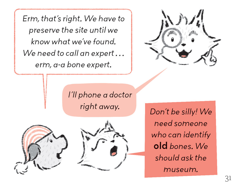
And if you missed their first adventure, Watts and Whiskerton: Buried Bones and Troublesome Treasure is out now. Have a look in your local library or a friendly bookshop near you.