Follow @tinyrexwrecks
Showing posts with label digital illustration. Show all posts

Wednesday, 31 July 2024

Pearl (Whiskerton)

This is Pearl. She's the Whiskerton half of Watts and Whiskerton, my new detective duo. You can read all about them in Watts and Whiskerton: Buried Bones and Troublesome Treasure.


Pearl meets Watts for the first time when he comes to stay at her home, Whiskerton Manor. She lives there with her dad, Count Whiskerton, and pretty much as soon as Watts arrives all sorts of strange goings-on start to occur. 


Pearl is incredibly smart and she loves mysteries, puzzles sand jigsaws. She really wants to be a detective. She persuades Watts to help her investigate the mysteries at the manor, and fills her new friend with confidence along the way.


This is the earliest sketch I can find of Pearl. At this point I had written 'Penelope?' beside her, but I wanted a more cat-like name so Pearl (Purr-l) was perfect. I've also changed her outfit. When I was looking through old-fashioned kids clothes I noticed a lot of them wore a version of a sailor suit, and it was so adorable I wanted Pearl to have one. I also got rid of her fangs. Some of the drawings in the book are so small that it was a detail that would get lost easily.

Right now I'm working on Watts and Whiskerton book 2 but book one is now available and you can buy it from your lovely local bookshop or by CLICKING HERE

Tuesday, 5 March 2024

Watts

This is Watts. He's one half of Watts and Whiskerton. He's the main character in my new book Watts and Whiskerton: Buried Bones and Troublesome Treasure. Pearl (Whiskerton) is equally important, but Watts is a writer and he narrates each books for us.


Watts comes from a family of famous detectives but he's not sure if he wants to be a detective too. So when his parents venture off to investigate a case, Watts heads off to Whiskerton Manor for a holiday. There he befriends Pearl Whiskerton. She loves mysteries and persuades Watts to help her investigate a series of strange goings on.


Watts actually began life as Watson. I wanted to create a character in the tradition of Watson and Hastings, a slightly silly detective's assistant. In the story I was writing Watson was much older and through his investigation he met Pearl, who was young and smart and methodical, and much more likely to solve the case. I abandoned this idea quickly because what Pearl really needed was a friend to help her solve the case, someone as intelligent as she was. I realised they had to be the same age. And suddenly they made sense as a pair. 


We changed his name to Watts before the first draft was written. We wanted a W name to sit nicely with Whiskerton. My editor, Ella, suggested Walker because it had a nice dog themed link and I really liked it until I thought of Watts. I loved how it reminded me of light bulbs and bright ideas, and how his name sounded like a question. He is also the son of Mr and Mrs Watts so technically he's still a Watts' son. 


I can't find my earliest sketchbooks but here is a drawing from an abandoned early plot idea.


Eagle-eyed readers will notice that this scene is still in the first book, just changed a little. This was drawn in pencil and then scanned into my computer. I love drawing in pencil but I do spend a lot of time tidying the outlines. I decided to see if it was possible to get a pencil-like quality digitally since I had 128 pages to illustrate. Here's one of the first digital tests.


I was pleased with the way this turned out and decided to make my first book 100% digitally. It did save me a lot of time when I was drawing outlines. 


Another early test that I really liked had the characters with no outlines at all but I realised I had to draw the outline, colour the character and then remove the outline so I might as well save myself time and keep the outline. Here's a peek at the finished artwork.


I'm really pleased with how it turned out.


Watts and Whiskerton: Buried Bones and Troublesome Treasure publishes on July 4th 2024 and is available for pre-order now by CLICKING HERE. Pre-orders really help authors because they show publishers and booksellers that there's interest in a book. And when it gets delivered you think, 'Ooh, a gift from my past self. How nice!'


Friday, 1 March 2024

Speech bubbles

My next book features one of my favourite things: speech bubbles. And my two main characters have their own designs.


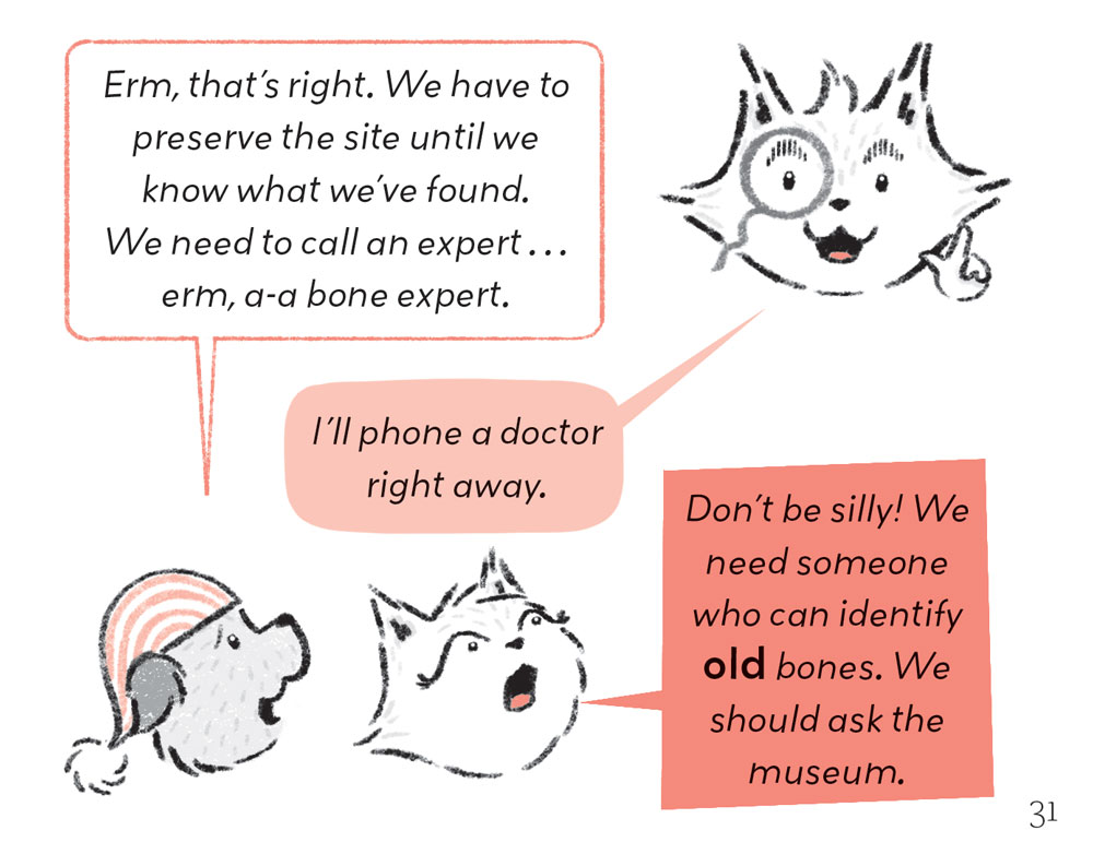
I wanted both Watts and Pearl's speech to have straight edges to show they are logical and that they have something in common but I also wanted their speech to reflect their individual personalities.

Pearl is unpredictable, spontaneous and quite loud so her speech bubbles have sharp, oddly angled edges and are a bold colour.

Pearl


Watts is more considered, speaks softly and is a little unsure of himself so his have rounded edges and no colour.

Watts


I wanted readers to be able to easily tell who was speaking when they speak to one another, and on occasions when the characters are very small the speech bubbles help identify them. Like this...


Everyone else in the book uses the same soft pink bubble. To have too many variations would get visually busy.

This is Houndstooth the gardener.

Watts and Whiskerton: Buried Bones and Troublesome Treasure publishes on July 4th 2024 and you can pre-order it by clicking here.

Monday, 11 April 2022

Tiger process

This is a little tiger idea I've been thinking about.  My idea feels too simple so I thought making some of the images might help unlock it.  There's a quick breakdown of how I made the image below.


I was working on this image on Friday which is also #colour_collective day, and I like to join in from time to time.  Luckily, the colours were a perfect fit for my tiger (see below).  I like how unusual the purpley blue is but I do think the darker colour I settled on is a bit punchier.

My colour collective original

Lately I've been making artwork like I would prepare a screen print.  For every colour I make a separate black layer.  Imagine the black lines are where the colour will be and imagine that where the paper is white will be clear.  Completely see through.  It takes a minute to get your head around this.  I like to use paint because I'm not very practised with a brush and it allows a less controlled line.  That's why I like this whole process, and it means I spend less time at a computer.

I knew this was going to be a two colour image (a dark and an orange plus white) but I wasn't sure if the background would be too busy so I broke the trees into two separations to make it easier to delete one if I needed to.  And I wanted to test the tiger outline in both paint and pencil so I kept that apart from the background.  This is what everything looks like separately.

Trees and paint tiger stripes


Bamboo

Tiger outlines and fur tests

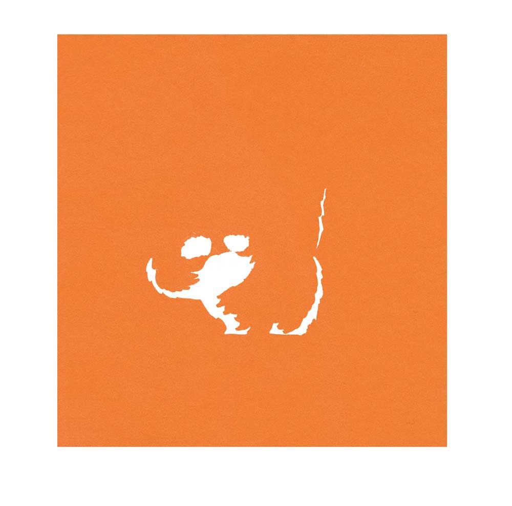
The top row is the tiger outline.  As much as I like my backgrounds to feel loose, I still like the control I have with a pencil for character outlines.  I've drawn it twice because I was testing a regular HB pencil (left) versus a softer colouring pencil line (right).  The second row is me testing the fur texture of the tiger.  Ultimately, I used the image on the right.  I placed this over the tiger and coloured everything outside of it black too.  This was going to be my orange layer.

If I lay them all over each other you can get an idea of what the image will look like.


All the separations placed over each other

I scan all of these into the computer and line them up on my page.  I spent some time deciding between the painted stripes and the pencil and edited the layers accordingly.

Once I've blocked in the basic colours it looks like this.

Dark layer
Orange

One layer over the other


I then spend some time editing the image, adding details like highlights, whiskers and fur lines, and I make the image more textured.  I have a selection of textures I've created that I delete from laters to make them look more worn.  I also decide on the final image to use a yellow layer over a red instead of one layer of orange.  That way I could delete parts of each colour and you'd see the red and yellow peek through.

The final image looks like this


It probably seems like a long way of doing things but I find the painting relaxing.  My previous Dream Cars post was made similarly except I drew all the colour layers digitally in Procreate, there was no painting.  That works well for me with vehicles and structured items but for more natural imagery I prefer to paint in a traditional way.


Thursday, 7 April 2022

Dream Cars

One of my earliest memories of school is being in Primary 1 and drawing a car.  They told us to draw anything we wanted and I couldn't think of anything but the person next to me was drawing a car so I drew one too.  I don't think I've drawn a car since.  So this week I had a go.  

This is Jon, he wanted to be a fox, in his dream car (which is almost exactly my actual car but according to him it's not the same).

And this is me in my Nissan Figaro.  They're such cute little cars.
Both images were sketched in pencil first and then redrawn in in Procreate using my sketch as a guide. The textures and colours were finalised in Photoshop.  I'm still far more skilled and at home in photoshop but I do enjoy drawing on the Ipad.  It's great for blocking in shapes.


Llama or Alpaca

This is a birthday card I made for my niece.  I'm pretty sure I've drawn a llama...but then again it could be an alpaca.


This image was drawn in Procreate and finished in Photoshop.  I love using limited colour palettes.

Wednesday, 2 February 2022

The Darling Children

These are the Darling children from Peter Pan by J.M. Barrie.  The first chapter has a lot of nice descriptions in it that feel very visual.  I love this one of the kids going to school.  I think it's the 'in a row' part I like so much. 

 '...and soon, you might have seen the three of them going in a row to Miss Fulsom's Kindergarten school, accompanied by their nurse.'

This image was made digitally in Procreate.  I like the ease of digital black and white drawing but I'm not convinced yet that it's a way for me to work permanently.  I still do love drawing in pencil.

Wednesday, 26 January 2022

Nutcracker

 A little Nutcracker I made before Christmas.  This was made digitally using Procreate.  I then added texture in Photoshop.  It's a two colour image and where they overlap the darkest tone is created.


Thursday, 4 November 2021

Wintry Woods jotter design

 I've recently added some A5 jotters to my shop. They weren't supposed to Christmassy but it's been pretty chilly here for a long time so I was feeling wintry, and really I'd like nothing more that a snowy mountain cabin to myself.

Click here to go to the shop.  

Here's a time lapse video of my cover design.


I did an initial sketch in my sketchbook and then drew straight on to Procreate.  I love how you can watch all the decisions you made.  I'm really happy with the way they turned out.  There's even a cute little 'This book belongs to' on the inside cover, and they're blank so you can sketch or write.  


Wednesday, 25 August 2021

Mr. Darling and Wendy


This is an image for J.M Barrie's Peter Pan.  Mr. Darling is trying to calculate whether they can afford their baby, Wendy.  I always find it a very funny moment as it's obviously too late.

This image was created in Procreate.

Monday, 16 August 2021

The Owl and the Pussycat


This is an image I created using limited colour.  There are two plus the outline.  I wanted to try and recreate the looser work I'd been making using paintbrushes but digitally.  The outline is hand drawn  but the colour is added in Procreate. 

Digital work makes it very easy to erase mistakes but they're often the lines that give images their charm.  So I did my very best not to hit the undo or delete button.  Does anyone else find it hard to just leave their artwork as it is and embrace the imperfections?

You can see more of my limited colour work on my website megmclaren.com


Tuesday, 1 June 2021

The View From Here

This was my #colour_collective for this week. 


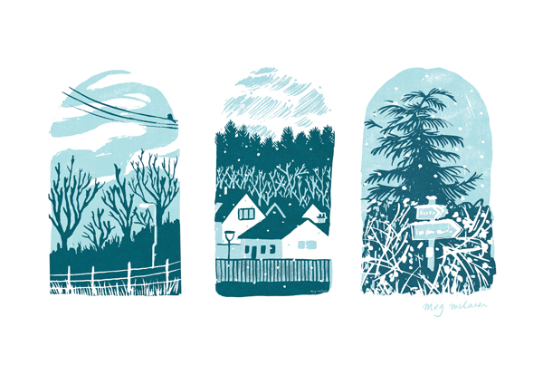
It's the view from my village woods across to the Black Isle.  I made this sketch sticking to the three colours I planned to use.  More and more I prefer to draw from life in my sketch book and only work from that image, as opposed to working from a photograph.  Sometimes I will take a photo for reference but, for me, a sketch really focuses in on what I noticed and what I liked about the scene in front of me.


When I got home I painted separations in black and coloured the image digitally.  Using a black layer for each colour means that it's hard to predict what the final image will look like.  I like the surprise of this.  I also like painting the layers because I'm not very good at it.  My brushwork isn't tidy and my hand isn't steady.  There's an element of it that I can't control and I really enjoy the results of that.


You can see below how layering them on top of one another starts to create the final image.  Colouring digitally does mean I can change things and you may notice that the big expanse of white water isn't in the separations.  That's because I painted it in the blue colour layer but removed it digitally as the image looked better without it.


I wasn't entirely happy with the result but after tweaking the colours and leaving it for a while, I much preferred it once I'd had some time away from it.  Some pictures are like that. 

Friday, 12 February 2021

Mirror, Mirror

This weeks #colour_collective fit in nicely with an illustration I did yesterday.  

Now available to buy as a greeting card.  Click here to go to the shop.


Final image.

I finally finished some pieces I'd been working on this week, had a tidy and decided to have a day drawing whatever I wanted.  And I had no idea what to do.  What do you draw when you can draw absolutely anything?  I usually revert to animals I like the look of, or things I've sketched before but never explored properly.  I find I think best when I start drawing.  I remembered a badger I'd drawn a long time ago so I drew badgers until I had an idea to make an image using only black and white animals.  


I liked that it looked like a Rorschach test.  I've been playing with Procreate lately and there's a symmetry function I hadn't used before and it's a lot of fun.  It's also so much faster to only draw half of an image.  I usually draw my outlines onto paper.  This is the first time I've really drawn everything onscreen. 

Procreate has a time lapse function so you can watch all the decisions being made in real time.  I finished the image in Photoshop so you only see up to a certain point here. 


Here's the original sketch.


What do you draw when you can choose whatever you want?  Do you have too many ideas or have to work them out on paper like I do?


Wednesday, 10 February 2021

Flawed

I've been painting up some of my #illo_advent drawings lately.  It's amazing to see the ones which work on a larger scale and the ones that don't.  Or is it because I'm not used to painting so my efforts are still hit and miss?


Each colour layer is painted separately in black gouache, scanned and coloured digitally.  I like using a traditional medium because of the unexpected marks and mistakes it creates.  Flaws.  I like flaws.  When I work digitally I always end up tidying too much.  This is a way for me to loosen up.  

If you happen to be frustrated by your process and want to loosen it up too I suggest playing with a new medium for a bit.  Recently I've been enjoying crayons and felt tip pens in limited colours.  I haven't found a way to incorporate them into my work yet but I've learned to enjoy the lack of control and enjoy the flaws.

Monday, 8 February 2021


This is a little hedgehog I made for #colour_collective  They post a colour every week and you make an illustration of your choice.  I don't often get the chance to join in, and I often struggle with a only colour for a prompt, but this week it was a really nice shade so I thought I'd have a go.  Why a hedgehog?  Who knows.  

I tried to stick to the more limited palettes I've been using lately.  I usually make sure I'm happy with the the drawing and then start colouring but I rushed this one and had to go about fixing it as I went.  Some people work like this all the time, adapting as they go, and I usually make small changes but for this one I was making separations.  Each colour layer was drawn in black so they shapes needed to be right to begin with and they weren't.  It's not a huge problem but it meant the process took longer than I wanted.  I should've taken my time to begin with.  

My top tip, if you work like me, is to make sure you're happy with your drawing.  It'll save time later.


Thursday, 31 October 2019

Happy Halloween!

I took some time off from making my book yesterday to draw a little spooky something.  As ever, I had elaborate plans for what I was going to do but I decided to just have a play for once and I'm pretty happy with this little spook.


I even had time to draw some pumpkins.  I don't get time to make many gifs but I like to make them now and then.  This one was fuelled by halloween candy.


Here's the image before animating it.


Happy Halloween everyone!