Follow @tinyrexwrecks
Showing posts with label limited colour. Show all posts

Thursday, 23 February 2023

Wee Unicorn - Colour Palette

As someone who loves printmaking I have always been a fan of the limited colour palette. My previous books have all featured items in whatever colour they needed to be but Wee Unicorn is different. I knew I was making a fantastical world and decided that would be the perfect environment to use heightened colour.

In the months prior to making the book I'd been doing a lot of sketching using only two or three coloured pencils. I was used to working in a limited way, and I loved the challenges it created.

I had one other reason: I knew my book was going to feature a Loch Ness monster style creature. Now, I live in the heart of Loch Ness monster country and there's a very distinctive colour I associate with it and many of the books about it. You can see it right in the middle of this Emily Mackenzie poster. Four rows down, four across: she calls it 'Nessie'.  


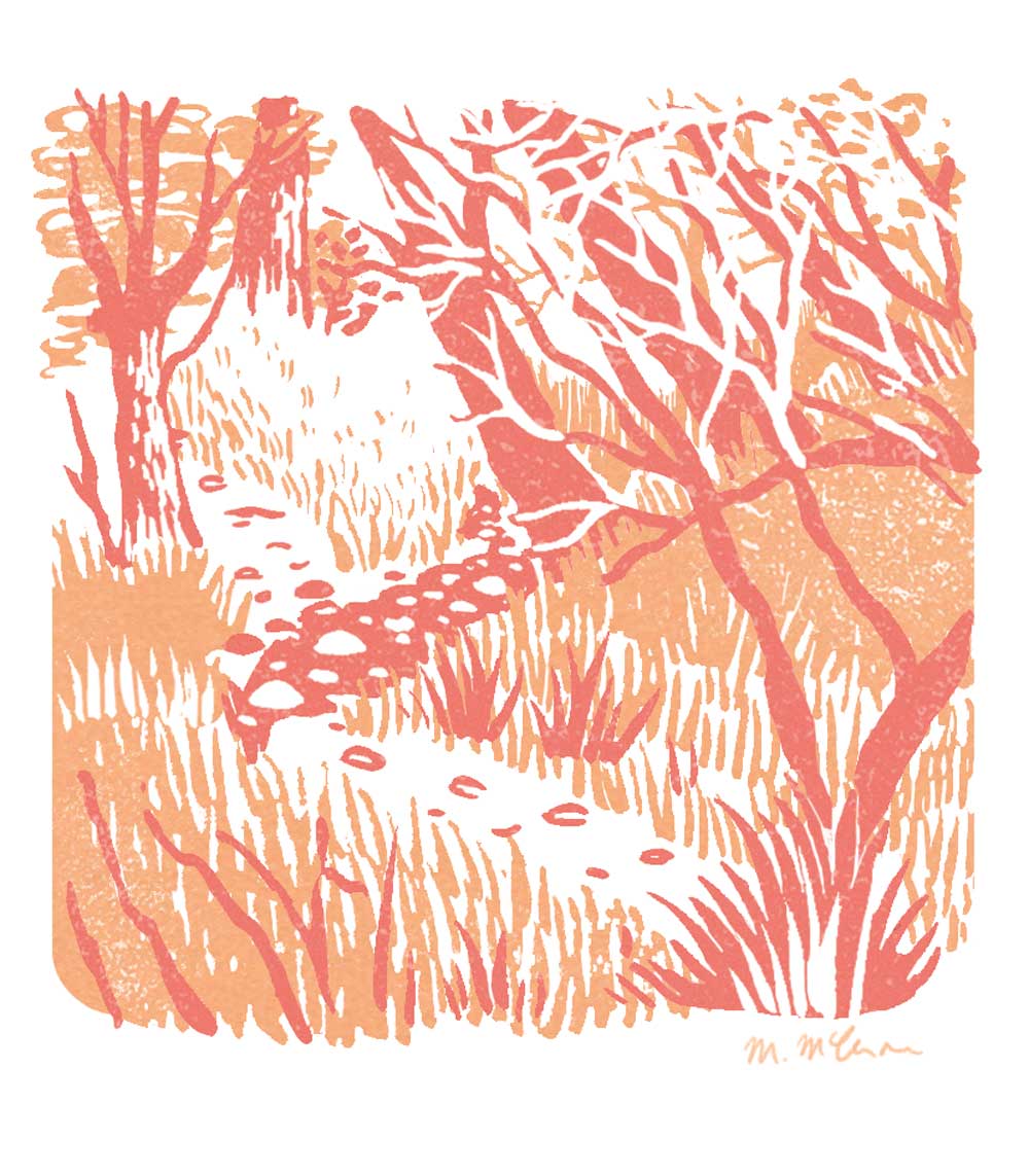
I wanted to avoid this colour. I wanted to make something contemporary and visually different so I decided to get rid of the green. Of course, I can create a green with my blue and yellow but I wanted to use it sparingly and definitely not for Ness. I also started sketching ideas for the book over winter when many of the greens were gone. We have so many burnt oranges, deep burgundies and purples in our landscape that I wanted to celebrate. When I started sketching the book I used these four colours.  


A peek in the sketchbook


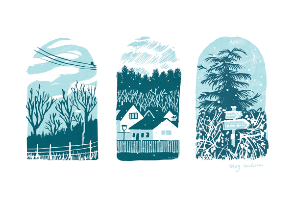
And I really liked them. When it came time to make the artwork for the book I did wonder if they'd be too overwhelming so I did a test page. This is a quick test on my Ipad to see how the blocks of colour might look.


Next I did a proper layout with the textures I was planning on using.


The larger image are the colours I ended up using. The smaller was an alternative I explored. As you can see they're incredibly similar but the turquoise was a little bluer, the pink a little brighter. And although these shades worked nicely, the secondary colours they created weren't as good.

These are my four final colours.

I used these four colours and layered them to make the secondary colours. If you imagine each colour is a layer of coloured glass it makes more sense to understand that when two of them overlap a new colour is created.  

You get even more variation when you start layering three or four of the colours together.  Here are a few different combinations from the book.


I like that the cover ended up being a nod to the colour palette.

I'm really pleased with the way the book turned out, and I really enjoyed working this way.  I'd love to do a book with only two colours someday.

Wee Unicorn is available to buy now. Click here for links.

Or you can look for it at your local library.


Wednesday, 27 July 2022

Bluebell Woods


A sketch of my local woods in two colours.  It gets full of bluebells, hence the title, but none were present when I drew it.


Thursday, 7 April 2022

Dream Cars

One of my earliest memories of school is being in Primary 1 and drawing a car.  They told us to draw anything we wanted and I couldn't think of anything but the person next to me was drawing a car so I drew one too.  I don't think I've drawn a car since.  So this week I had a go.  

This is Jon, he wanted to be a fox, in his dream car (which is almost exactly my actual car but according to him it's not the same).

And this is me in my Nissan Figaro.  They're such cute little cars.
Both images were sketched in pencil first and then redrawn in in Procreate using my sketch as a guide. The textures and colours were finalised in Photoshop.  I'm still far more skilled and at home in photoshop but I do enjoy drawing on the Ipad.  It's great for blocking in shapes.


Llama or Alpaca

This is a birthday card I made for my niece.  I'm pretty sure I've drawn a llama...but then again it could be an alpaca.


This image was drawn in Procreate and finished in Photoshop.  I love using limited colour palettes.

Wednesday, 26 January 2022

Nutcracker

 A little Nutcracker I made before Christmas.  This was made digitally using Procreate.  I then added texture in Photoshop.  It's a two colour image and where they overlap the darkest tone is created.


Monday, 4 October 2021

Christmas cards 2021

 I know it's still a little early, the pumpkins aren't even carved yet, but I'm getting organised this year.  I still have a book to finish so my Christmas cards have come early.  

There are 4 new designs, each made in Procreate, and sold as a pack of 4.  You can buy them here


Monday, 16 August 2021

The Owl and the Pussycat


This is an image I created using limited colour.  There are two plus the outline.  I wanted to try and recreate the looser work I'd been making using paintbrushes but digitally.  The outline is hand drawn  but the colour is added in Procreate. 

Digital work makes it very easy to erase mistakes but they're often the lines that give images their charm.  So I did my very best not to hit the undo or delete button.  Does anyone else find it hard to just leave their artwork as it is and embrace the imperfections?

You can see more of my limited colour work on my website megmclaren.com


Tuesday, 1 June 2021

The View From Here

This was my #colour_collective for this week. 


It's the view from my village woods across to the Black Isle.  I made this sketch sticking to the three colours I planned to use.  More and more I prefer to draw from life in my sketch book and only work from that image, as opposed to working from a photograph.  Sometimes I will take a photo for reference but, for me, a sketch really focuses in on what I noticed and what I liked about the scene in front of me.


When I got home I painted separations in black and coloured the image digitally.  Using a black layer for each colour means that it's hard to predict what the final image will look like.  I like the surprise of this.  I also like painting the layers because I'm not very good at it.  My brushwork isn't tidy and my hand isn't steady.  There's an element of it that I can't control and I really enjoy the results of that.


You can see below how layering them on top of one another starts to create the final image.  Colouring digitally does mean I can change things and you may notice that the big expanse of white water isn't in the separations.  That's because I painted it in the blue colour layer but removed it digitally as the image looked better without it.


I wasn't entirely happy with the result but after tweaking the colours and leaving it for a while, I much preferred it once I'd had some time away from it.  Some pictures are like that. 

Tuesday, 30 March 2021

 New in my shop this week are these Wild Woods risographs.  Click here to go to the shop.


Risographs are an environmentally friendly form of printing. The image is printed using soy ink on recycled 250gsm paper.  It has a similar feeling to a screen print but the printing is done through a risograph machine and so is less labour intensive.  


Friday, 19 March 2021

Book Nook Blue


Another colour_collective.  This time they chose a colour that I use all the time.  This dark blue features heavily in my work. Trying to decide what to do felt odd because I've never noticed how much I use it before.  To do something specifically with this colour felt like pressure had been added.  Anyway, I like the beaver.

Monday, 22 February 2021

Squirrels and wolves and bears, oh my!

I've been playing with symmetry again but this time I wanted to use it as a base for an image, with different parts on each side to show a seasonal shift.  I started again with my stag motif.  I wanted it to feel very Highland but the bears and wolves are pure artistic license.


I've enjoyed playing more with line and limited colour lately. These feel like an evolution of my advent illustrations which you can see here.  

Here is the original pencil drawing  I only drew half and then copied and flipped it in photoshop so I had two sides.  The animals were drawn separately.


The line work was done in Procreate and the colour was added in Photoshop.  
A few close ups.


I'd like to explore line work like this for book chapter headings or cover art but for now it's very new and something I enjoy playing with.


Wednesday, 10 February 2021

Flawed

I've been painting up some of my #illo_advent drawings lately.  It's amazing to see the ones which work on a larger scale and the ones that don't.  Or is it because I'm not used to painting so my efforts are still hit and miss?


Each colour layer is painted separately in black gouache, scanned and coloured digitally.  I like using a traditional medium because of the unexpected marks and mistakes it creates.  Flaws.  I like flaws.  When I work digitally I always end up tidying too much.  This is a way for me to loosen up.  

If you happen to be frustrated by your process and want to loosen it up too I suggest playing with a new medium for a bit.  Recently I've been enjoying crayons and felt tip pens in limited colours.  I haven't found a way to incorporate them into my work yet but I've learned to enjoy the lack of control and enjoy the flaws.

Monday, 8 February 2021


This is a little hedgehog I made for #colour_collective  They post a colour every week and you make an illustration of your choice.  I don't often get the chance to join in, and I often struggle with a only colour for a prompt, but this week it was a really nice shade so I thought I'd have a go.  Why a hedgehog?  Who knows.  

I tried to stick to the more limited palettes I've been using lately.  I usually make sure I'm happy with the the drawing and then start colouring but I rushed this one and had to go about fixing it as I went.  Some people work like this all the time, adapting as they go, and I usually make small changes but for this one I was making separations.  Each colour layer was drawn in black so they shapes needed to be right to begin with and they weren't.  It's not a huge problem but it meant the process took longer than I wanted.  I should've taken my time to begin with.  

My top tip, if you work like me, is to make sure you're happy with your drawing.  It'll save time later.


Thursday, 24 December 2020

Winter Blues

 Heres my finished #illo_advent for 2020


Have a lovely Christmas.  See you in 2021!


Some of the designs are now available as a set of notecards.  Click here to go to the shop.


Friday, 28 June 2019

Seas and leaves

I've been playing around with some limited colour palettes just for the fun of it.  It's an interesting challenge and I like the problem solving aspect of it.  My books are very much planned out, outlines are drawn in pencil, scanned and have to be tidied, and with so many colours to choose from it can take a lot of time to finish a page.  For these everything is created completely digitally.  I don't really plan out what I'm going to draw beforehand so I like that I get to make it up as I go.  It's a faster way for me to work.  I also never really play with pattern so that's fun too.