Follow @tinyrexwrecks

Friday, 23 February 2024

Roughs

When you illustrate a book you go through a stage called roughs. These are ideas of what will be drawn on every page of the book, bearing in mind where text will fit, and as their name suggests they are rough drawings. There are varieties of roughs though. I've seen some much looser than mine, and others so polished they look like finished artwork. Because picture books are so much about the images I make my roughs while I write. I can't separate the two processes.


Watts and Whiskerton is a highly illustrated young fiction book and I wanted the illustrations to be as important as the text. They hold visual pieces of information and readers will flit between the body of text, illustrations with speech bubbles and little comic strips. It sort of looks like the inside of my head. This is how I think. So as I wrote the first draft I created an even rougher set of roughs to send to the editor with the text to help her make sense of the book. It also really helped me pace the page turns and develop the plot. I call these rough roughs.

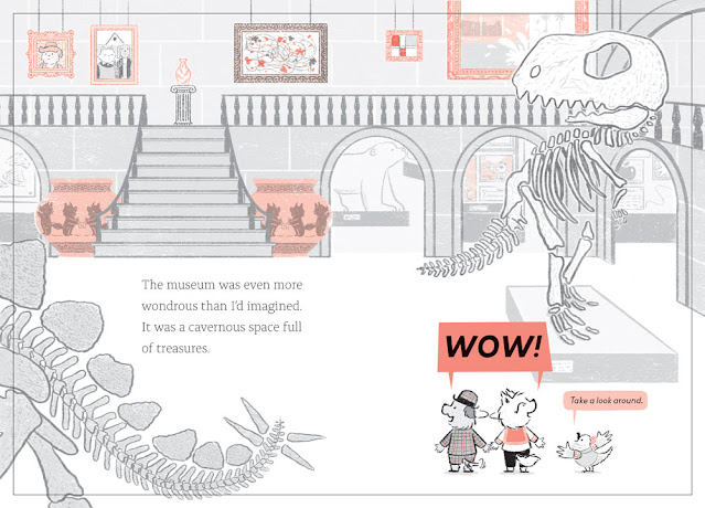
Here is the rough rough of the museum.


At this stage it's not necessary for me to know what the little details in the book will be, and to be honest I was scared to draw a whole museum.

Once the text was finalised and set by the art director, Sarah, we flipped the image to make sure the text was read before the 'Wow!' and more detail was added. This is the proper rough, there's a whole chunk of time scheduled to make these. This a simple spread but on others we had to cut text to fit or adjust the layout altogether.

The pink part is where you can't put any important information in case it gets chopped off.

This is the final image.

The black line is where the pages will be cut.

The details include some exhibits for Watts and Whiskerton to investigate later and nods to some famous paintings including A Bigger Splash by David Hockney because a swimming pool is a plot point in the book.


Watts and Whiskerton; Buried Bones and Troublesome Treasure publishes July 4th 2024 and is available to buy by clicking here.

Friday, 16 February 2024

Cover Ideas

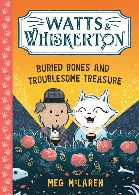
 My last post was the cover reveal of my next book, Watts and Whiskerton: Buried Bones and Troublesome Treasure. Here's a little breakdown of how the cover was made.


Usually when you're part way through colouring the insides of a book someone will mention the cover, and you think, 'The Cover?!' Or I do because I never have a vision for book covers until I'm asked to think about it. So when the cover question arises I sit and sketch little thumbnail ideas and I send these to the art director, Dominica, to see if she thinks any of them are worth developing further. Sometimes it's elements for various ideas.

Can you see which one became the cover?

We hadn't yet discussed how the title was going to appear but she soon sent some variations on the Watts and Whiskerton branding for me to choose from, picked some favourite ideas and made some suggestions about moving forward. We'd discussed using a faux quarter binding too (that little decorative strip down the book's edge.)

Then I sent these...


We decided to use the lower left torchlit image but to add some bones and treasure for hints of colour, and I was asked to send some colour ideas. I sent endless variations. Honestly, there were so many. The paw print pattern is used inside the book and we decided this would work nicely for the quarter binding too. Here are a select few of the colour trials.

There were also decisions to be made about Pearl's outline and Watts' suit colour because the insides of the book are limited to black, white and red but on the cover we can do what we want.


We picked the blue suit.


Watts and Pearl together.


From then on it's a case of me making the thing properly, asking for suggestions when I get stuck and then adding more until we all agree that it's finished. We decided to contain the Watts and Whiskerton lettering in a frame and removed the house silhouette. They were fighting each other. I added some coins and rose petals to add colour to the lower underground section and we used the red from the inside of the book for the quarter binding. I think it turned out nicely. Here's the final cover...


Watts and Whiskerton: Buried Bones and Troublesome Treasure publishes July 4th 2024 and is available to buy at your local friendly bookshop, just ask them. Online you can buy here.

Friday, 17 November 2023

Cover reveal!

 This is the front cover of my next book, Watts and Whiskerton: Buried Bones and Troublesome Treasure.


This book will be a two colour chapter book for slightly older readers than my usual work. The plot is a mystery so it's a little more complex than a picture book but it's very highly illustrated so really ages 5 and up can enjoy it.

You can pre-order the book by clicking here. Pre-ordering is really helpful for authors because it lets people know you are interested in their books. So if you want a copy of any book don't be afraid to ask your local bookshop to order it in before it's released. You can also order online early.

I'll post a blog about how the cover art was made soon.


Thursday, 2 November 2023

Book one done!

 This was me last week.


I finally finished the artwork for my next book, Watts and Whiskerton: Buried Bones and Troublesome Treasure. It is the first book in my young fiction series to be published by Piccadilly Press. You can read more about it by clicking here.

I'm really excited about. It's a highly illustrated mystery featuring Watts, the dog, and Pearl Whiskerton, the cat. Together they team up and solves a series of mysterious goings on at Whiskerton Manor.

Buried Bones and Troublesome Treasure will publish in July 2024.

Tuesday, 31 October 2023

Waterstones Best (wee) Books 2023

 I was really excited this week to find out that Wee Unicorn is on Waterstones Best Books 2023!

It's in amongst a lovely bunch of children's books, a great place to start your xmas list making. I've already spotted a few I'd like this year. There are lists of grown up books too but let's face it, the children's sections are the best ones. Thank you to all the lovely bookshops and booksellers who have been kind enough to recommend my book this year.


Thursday, 23 February 2023

Wee Unicorn - Colour Palette

As someone who loves printmaking I have always been a fan of the limited colour palette. My previous books have all featured items in whatever colour they needed to be but Wee Unicorn is different. I knew I was making a fantastical world and decided that would be the perfect environment to use heightened colour.

In the months prior to making the book I'd been doing a lot of sketching using only two or three coloured pencils. I was used to working in a limited way, and I loved the challenges it created.

I had one other reason: I knew my book was going to feature a Loch Ness monster style creature. Now, I live in the heart of Loch Ness monster country and there's a very distinctive colour I associate with it and many of the books about it. You can see it right in the middle of this Emily Mackenzie poster. Four rows down, four across: she calls it 'Nessie'.  


I wanted to avoid this colour. I wanted to make something contemporary and visually different so I decided to get rid of the green. Of course, I can create a green with my blue and yellow but I wanted to use it sparingly and definitely not for Ness. I also started sketching ideas for the book over winter when many of the greens were gone. We have so many burnt oranges, deep burgundies and purples in our landscape that I wanted to celebrate. When I started sketching the book I used these four colours.  


A peek in the sketchbook


And I really liked them. When it came time to make the artwork for the book I did wonder if they'd be too overwhelming so I did a test page. This is a quick test on my Ipad to see how the blocks of colour might look.


Next I did a proper layout with the textures I was planning on using.


The larger image are the colours I ended up using. The smaller was an alternative I explored. As you can see they're incredibly similar but the turquoise was a little bluer, the pink a little brighter. And although these shades worked nicely, the secondary colours they created weren't as good.

These are my four final colours.

I used these four colours and layered them to make the secondary colours. If you imagine each colour is a layer of coloured glass it makes more sense to understand that when two of them overlap a new colour is created.  

You get even more variation when you start layering three or four of the colours together.  Here are a few different combinations from the book.


I like that the cover ended up being a nod to the colour palette.

I'm really pleased with the way the book turned out, and I really enjoyed working this way.  I'd love to do a book with only two colours someday.

Wee Unicorn is available to buy now. Click here for links.

Or you can look for it at your local library.


Thursday, 2 February 2023

Wee Unicorn - Character Design


The weird thing about living in Scotland is that there are unicorns everywhere.  On flags, as statues, and on coats of arms, but after a while you stop noticing them.  They're our national animal.  Here are a few of the Inverness unicorns.


Before I wrote Wee Unicorn I hadn't given them a lot of thought.  And I'd unfairly been a little dismissive of them lately.  There seemed to be unicorns everywhere. 

Normally when I write a book I come up with the character first.  For Wee Unicorn I'd been discussing Scottish folklore ideas and creatures with my editor and so I didn't actually have a character yet.  The first challenge for me was to see if I could draw a unicorn (at all!) but, more importantly, one that felt like mine.

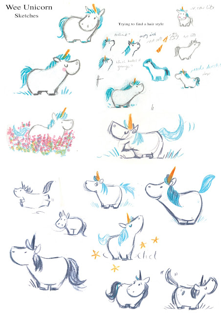
My immediate worry was that unicorns are horses, and wise illustrators know to avoid these because horses are hard to draw.  But all of my main characters are very young, they're the equivalent age of the child reading the book, so they're often small too.  Lesson one: small horses are easier to draw than tall ones.  Manes are harder to draw than you'd expect.  These are the first sketches I did. 


It's hard to describe what I'm looking for when I do these.  I'm obviously looking at things like face shape and proportion, trying to make the most appealing version I can, but I'm also looking for personality.  A drawing that is not just a drawing but that has a little bit of life in it: a character.  It's one of those know it when you see it sort of things.


You can see I'm experimenting with textures, the mane, the first inkling of a scarf, and I'm adding little bits of information that will eventually make up the story.  I don't really know anything about character design but I always draw mine in different moods and situations.  My character design always ends up being how I figure out what the book is about.

Here I've moved on to playing with colour and working out what a Wee Unicorn might actually do all day.  There were many things to consider.  Does my character use their hooves like hands?  Walk on hind legs?  I wanted her to be essentially horse-like, but that does limit what the character can do, especially one so small.  I kept hearing talk of unicorns being magic but it made no sense to me.  I didn't understand how they were magic, what their powers were or why.  Funnily enough, this became my way into the book.  I decided to write about a unicorn who was very small, loud and not magic, even though everyone expected her to be.  I wanted her everyday qualities, ones that were taken for granted, to be what was truly magical about her.  Once you know who your character is they are easier to write about.

Even though I'm experimenting with markings you can she's almost the Wee Unicorn from the book.

I knew my backgrounds were going to be very vibrant so I wasn't too worried about Wee Unicorn being pure white.  I thought she'd stand out nicely but I did want to give her a little something.  I thought a scarf would be a nice detail.  You get a lot of movement in a scarf if your character is running or the wind is blowing.  It's a nice pop of colour and it's cold in the highlands too.


I wanted to keep it traditional looking so I made my version of a Fair Isle knit.  I chose the crown as a motif because unicorns are seen with a crown around their necks on the coat of arms.  I wanted to add a little nod to that.


Wee Unicorn is published by Hachette Children's Books and is available to pre-order now.
Please support your local bookshop or an online indie if you can.

Here are a few places you can buy it CLICK HERE